Showing posts with label IELTS Academic Writing Task 1. Show all posts

Thursday, November 19, 2020

IELTS Book 3 Test 1 Writing Task 1


The charts below show the number of Japanese tourists traveling abroad between 1985 and 1995 and Australia's share of the Japanese tourist market. Write a report for a university lecturer describing the information shown below.

Japanese tourists traveling abroad between 1985 and 1995

Australia's share of the Japanese tourist market

The bar chart outlines how many Japanese travelled overseas between 1985 and 1995 while the line graph delineates the percentages of these tourists who visited Australia in particular between 1985 and 1994. Overall, the number of Japanese who made overseas travels soared and this is also true for the Australia visiting travelers from Japan.

As can be seen from the illustration, around 5 million Japanese citizens travelled different countries in 1985 which kept on increasing each year except in 1991. From approximately 7 million tourists in 1987, it went as high as 12 million in just 6 years. Finally, in 1995, around 15 million Japanese toured foreign countries which was three times higher than that of a decade earlier.

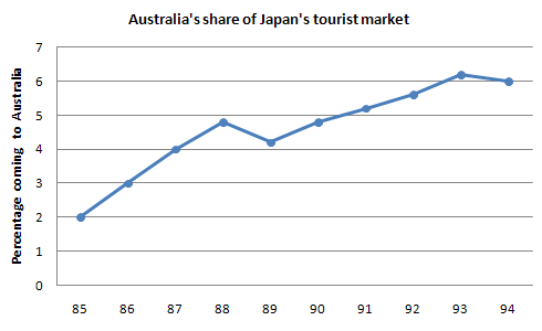
The line graph shows that 2% Japanese tourists reached Australia in 1985 and with a steady increase this figure went as high as roughly 5% in 1988. The next year the ratio slightly dipped but went higher each year in the subsequent years. Australia received more than 6% Japanese travellers in 1993, the highest, which stood at exactly 6% in 1994. 

IELTS Book 2 Test 4 Writing Task 1

The table below shows the figures (in thousand) for imprisonment in five countries between 1930 and 1980. Write a report for a university, lecturer describing the information shown below.

Table - the figures for imprisonment in five countries

The bar chart depicts the number of prisoners in thousands, in five different countries, namely Great Britain, Australia, New Zealand, United States and Canada during a period of 50 years commencing from 1930. Overall, the graph gives an impression that, imprisonment rate in the USA and UK escalated over the time while in Canada, Australia, New Zealand, it actually decreased.

As is evident in the presentation, Great Britain had the lowest number of imprisonment throughout the initial 40 years till 1980. Interestingly, Britain had witnessed a steady growth in figures, which started from around 30000 in the year 1930 and reached around 70000 in the year 1970. By contrast, the United States had the maximum number of criminals throughout the entire span of years except in the first decade, which is 1930. Moreover, in the year 1980, United States had to imprison the highest number of citizens in the entire period, which accounted for around 130000.

It is apparent from the graph that the crime rate in Canada had fallen gradually and steadily, from 120000 people in 1930 to a significantly less 90000 people in 1980. However, except for the years, 1930 and 1980, Australia had considerably less number of jailing and the New Zealand had always positioned as top three consistently just behind Canada and the United States.

IELTS Book 2 Test 3 Writing Task 1

The first chart below shows the results of a survey which sampled a cross-section of 100,000 people asking if they traveled abroad and why they traveled for the period 1994-98. The second chart shows their destinations over the same period. Write a report for a university lecturer describing the information shown below.

The provided charts show the data of a survey conducted on 100,000 people and the statistics shows the number of UK citizen travelled abroad from 1994 to 1998 for different purposes and their destinations. As is observed from the given graphs, most of the UK residents travelled on their holidays and Western Europe was their most favourite destination.

Initially, in 1994, more than 22 thousand UK resident travelled to different foreign countries and among them, more than 15 thousand went on their holidays. For business tours, more than 3 thousand people travelled in other countries in the same year while more than 2 thousand people visited their friends and relatives. After 1 year, this number slightly decreased and for the rest of the years until 1998, the number steadily increased in almost all of the categories. Finally, in 1998, the total traveller number reached more than 28 thousand and among them, more than twenty thousand people travelled to enjoy their holidays.

In 1994, almost 18 thousand people out of 22 thousand went to Western Europe which is significantly larger than the number of people travelled to North America and other parts of the world. The similar trends can be observed for the remaining years and the majority people of the UK went to Western Europe which makes this place the most popular tourist’s destination of UK people.

IELTS Book 2 Test 2 Writing Task 1

The chart below shows the amount of leisure time enjoyed by men and women of different employment status. Write a report for a university lecturer describing the information below.

Leisure time enjoyed by men & women of different employment status
The provided chart shows the number of leisure hours enjoyed by men and women in a typical week in 1998-99, according to gender and employment status. As is observed from the graph, the unemployed and retired men and women had more leisure time than the other type of people.

Among the full-time employed people, men had about 45 hours of leisure time on an average per week compared to the 38 hours of leisure time for women. No data is given for the part-time employed men and women from this category enjoyed 40 hours of leisure time in a week. This figure is slightly more than the employed women perhaps because of their employment nature.


Unemployed and retired people had the longest period of leisure activity both for men and women and men had a bit more hours than the women. As expected the retired and unemployed people enjoyed about 78 to 82 hours per week which is longer than people from other employment statuses. Lastly, housewives enjoyed approximately 50 hours of leisure time which is more than the employed women but less than the unemployed and retired women. The graph reflects that men had more leisure time from all employment statuses than women which indicates that women spent more time working at home than their male counterparts.

IELTS Book 2 Test 1 Writing Task 1

The table below shows the consumer durables (telephone, refrigerator, etc.) owned in Britain from 1972 to 1983. Write a report for a university lecturer describing the information shown below.


The provided table represents information on the percentage of consumer devices owned by British people from 1972 to 1983. Generally speaking, the most popular electronic item in Britain was television, whereas the less owned household appliances were dishwasher and video which had been introduced to the British families later in 1978 and 1983 respectively.


As is observed from the given data, almost one-third households in Britain had central heating machines in 1972 and the percentage increased each year and reached to 64% in 1983, which shows that the central heating machine users almost doubled in 12 years. Again, Television was the most common household equipment as 93% households had them. This ration reached to 98 percent with slight increase year by year. However, the video was introduced in 1983 when only 18% houses had them. Then Vacuum cleaner, refrigerator and washing machines were three most popular household appliances after TV which was owned by 70% house owners in 1972 and the percentages increased to over 90 after 10 years. 

Interestingly, dishwashers were very less popular as only 3% families owned them initially in 1978 and their user's percentages reached to only 5 in 1983. Finally, the percentage of houses that had telephones was only 42% but with their popularity, this percentage reached to 77 after 12 years.

IELTS Book 1 Test 4 Writing Task 1

Chorleywood is a village near London whose population has increased steadily since the middle of the 19th century. The map below shows the development of the villageWrite a report for a university lecturer describing the development of the village.

Steady population increase in Chorleywood

The diagram outlines the development that the Chorleywood village of London witnessed between 1868 and 1994. Overall, development works in this village were done in different periods and much of these constructions were done between 1970 and 1994. Interestingly, transportation facility defined the are of development in this village.

According to the diagram, the motor road was established in 1970 while the railway was built in 1909 in Chorleywood. Before 1900, only a portion of the village was developed and later (between 1883 and 1922) the station was built and some development works were finished. The area near the station was then improved and during the end of this construction, in 1970 to be precise, the motorway was completed. After 1970, the expansion process seemed accelerated and many areas of the village came under the renovation process. At the beginning of 20th century, the railway was built.

The land roads including the motorway, roads and railroads of this village connect almost all of the parts of the city and forms and hash like shape. The progress in this area had been done mostly based on the establishment of the transportation systems but the park and the golf course were placed in the middle of the village.

IELTS Book 1 Test 3 Writing Task 1

The chart below shows the amount of money per week spent on fast foods in Britain. The graph shows the trends in consumption of fast foods. Write a report for a university lecturer describing the information shown below.

Money spent on fast food per week in Britain

Consumption of fast food in Britain per person (in gram).

The column graph shows how much money the British citizens spent on three fast food items based on their economic status in 1990 while the line graph reveals the consumption of these items during 1970 and 1990. Overall, rich British spent more on junk food than low-income class in 1990 and fish & chips became the most consumed junk food over the period.

It is interesting to note that, wealthy British spent more on hamburgers while less on fish & chips. They drained around 45 pence per person in a week for hamburgers while roughly 15-20 pence on other two items. Moderate income class prefered hamburger but spend approximately 33 pence on that. They spent the least on the pizza which amounted for nearly 12 pence. Low-income class, on the contrary, spent less on fast foods and they spent between 7 to 14 pence for each item, despite fish and chips being their most favourite.

According to the line graph, British citizens consumed pizza more than other two items. In 1970, consumption of pizza was 300 gm per person while it was less than 100 gm for other two items. Over the time, fish & chips became the most consumed fast food with 500 gm consumption. During this time, pizza became less popular while hamburger gained some popularity. 

IELTS Book 1 Test 2 Writing Task 1

The diagram below shows how the Australian Bureau of Meteorology collects up-to-the-minute information on the weather in order to produce reliable forecasts. Write a report for a university lecturer describing the information shown below.

Writing task 1 - How Australia collects information on weather

The given diagram shows how the weather information is collected by Australian Bureau of Meteorology to provide accurate and updated weather forecasting. As is observed from the given illustration, the weather information collection is done via satellites, radars and drifting buoys and then analysed before broadcasting them to the public.

As is presented in the diagram, the weather information is collected using three different types of sources namely, satellites, radars and drifting buoys. The raw data collected from satellites is basically satellite photos while radar information is observed from the radar screens and the synoptic charts are yielded from the drifting buoys and these three types of data are fed into a computer system to analyse and prepare the weather news for broadcasting.
      
After that, the weather, the news is broadcasted in different public media like televisions, radios and telephones. The final information regarding the weather is provided to the public via TV news, radio broadcasting and as a recorded announcement in devices like telephones.

IELTS Book 1 Test 1 Writing Task 1

The charts below show the result of a survey of adult education. The first chart shows the reason why adults decide to study. The pie chart shows how people think the costs of adult education should be shared. Write a report for a university lecturer, describing the information shown below.

Reasons why adults decide to study - Bar graph

How the costs of each course should be shared - Pie Chart 

The figures illustrate the result of an opinion survey about the reason why adult people choose to study and how tuition costs should be funded. It is clear that based on the survey result, the two main reasons why adults have continued their study are due to they are interested in subjects and to obtain the degree. It is also noticed that the survey also shows that most of the education cost should be funded by individuals themselves. 

It can be seen that the two main purposes why adult continue their study are because they interested with the program and to obtain the qualification, as these two reasons result reached 40% and 38% respectively. Meanwhile, the percentages of the survey for reasons of helpful for their current job, improving prospect and promotion, and that they like studying were in the range between 22% and 20%. As for figures of those who study for the purpose of changing jobs and to meet new people, they were below 15% each. 

As for the survey result of the education cost, it is obvious that 40% of the cost should become the burden of the respective person themselves. Then 35% should be provided by the employer and 25% from the taxpayer.