The table below shows the figures (in thousand) for imprisonment in five countries between 1930 and 1980. Write a report for a university, lecturer describing the information shown below.

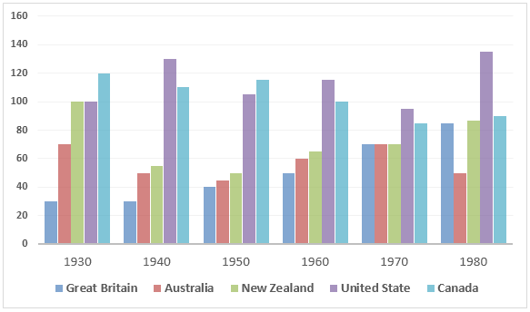
The bar chart depicts the number of prisoners in thousands, in five different countries, namely Great Britain, Australia, New Zealand, United States and Canada during a period of 50 years commencing from 1930. Overall, the graph gives an impression that, imprisonment rate in the USA and UK escalated over the time while in Canada, Australia, New Zealand, it actually decreased.
As is evident in the presentation, Great Britain had the lowest number of imprisonment throughout the initial 40 years till 1980. Interestingly, Britain had witnessed a steady growth in figures, which started from around 30000 in the year 1930 and reached around 70000 in the year 1970. By contrast, the United States had the maximum number of criminals throughout the entire span of years except in the first decade, which is 1930. Moreover, in the year 1980, United States had to imprison the highest number of citizens in the entire period, which accounted for around 130000.
It is apparent from the graph that the crime rate in Canada had fallen gradually and steadily, from 120000 people in 1930 to a significantly less 90000 people in 1980. However, except for the years, 1930 and 1980, Australia had considerably less number of jailing and the New Zealand had always positioned as top three consistently just behind Canada and the United States.
No comments:
Post a Comment